
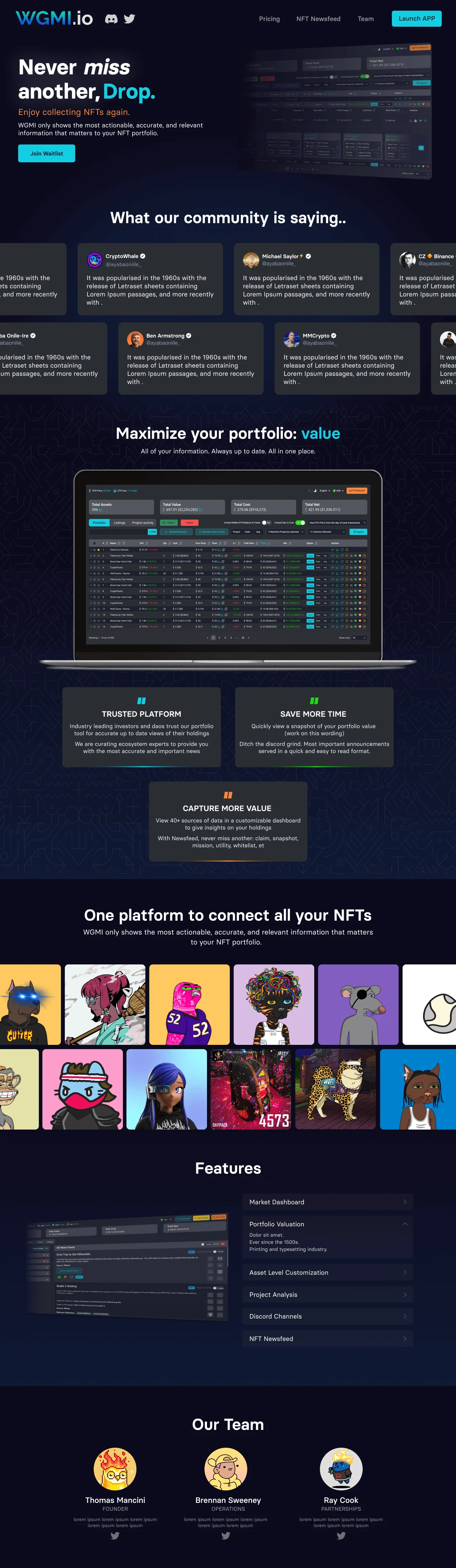
This case study highlights the improvements made to the user interface of WGMI dashboard which tracks users’ Non-Fungible Tokens (NFTs) and their associated traits. The focus was on enhancing the cleanliness, usability, and user experience by addressing issues related to low contrast, small font size, and inadequate access to complete NFT information. The solution involved complete revamping and implementing a sliding feature to display additional details when a user clicks on a specific NFT row.
Introduction
My Role
Product Design
Creative Direction
Company
WGMI
Problem Statement:
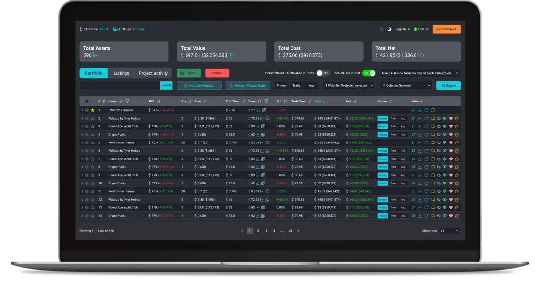
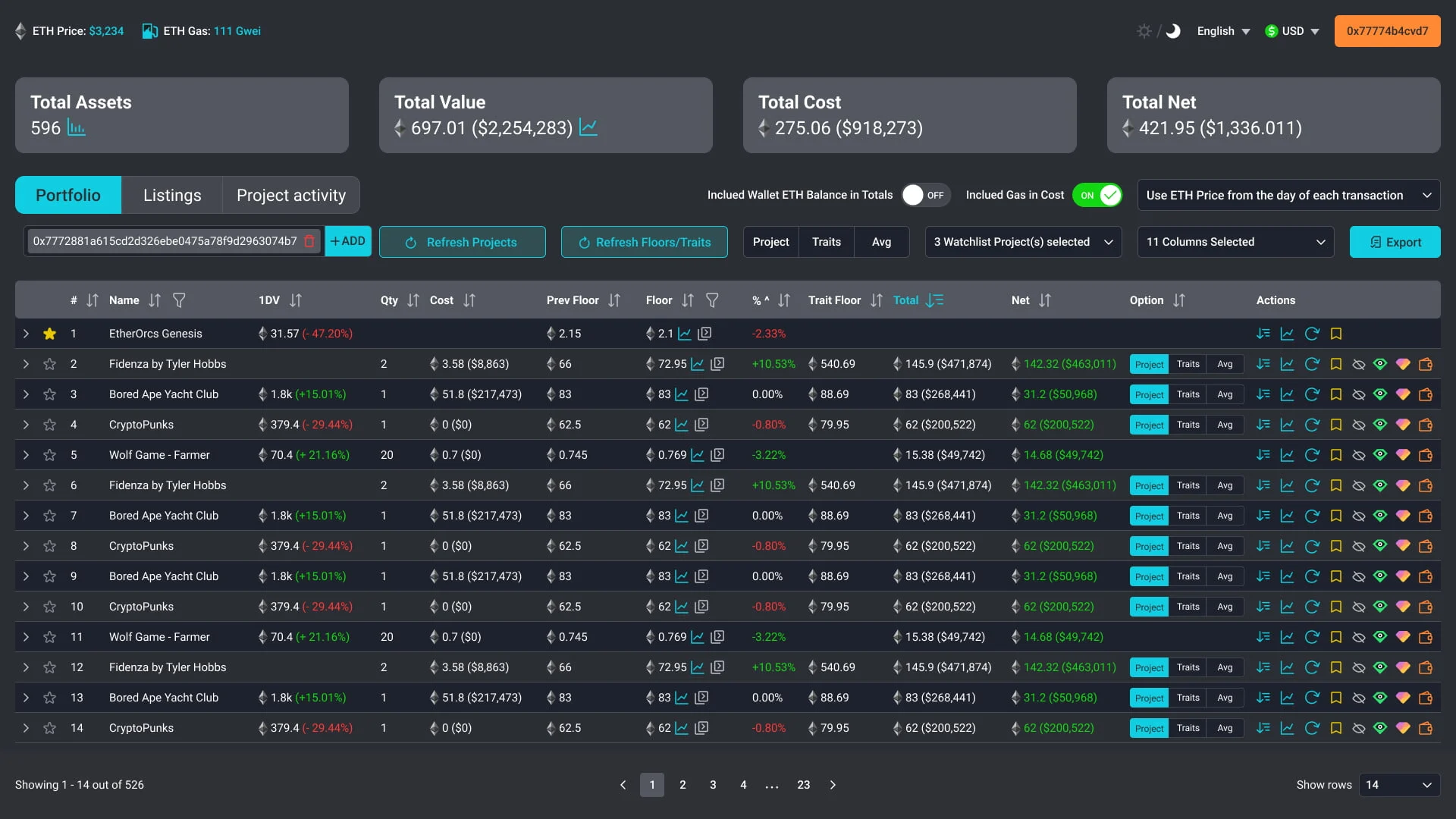
The original UI suffered from poor contrast and small font size, making it difficult for users to read and comprehend the information presented. Additionally, users found it frustrating when they couldn’t access the complete NFT information within the limited space provided.
Research and Analysis:
To gain insights into user pain points, we conducted user interviews, gathered feedback, and performed usability tests on the existing UI. The research findings confirmed that users were indeed struggling with readability and the inability to access complete NFT information.
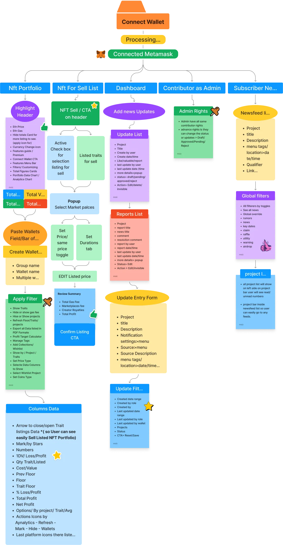
Wireframes
User Journey:
To gain insights into user pain points, we conducted user interviews, gathered feedback, and performed usability tests on the existing UI. The research findings confirmed that users were indeed struggling with readability and the inability to access complete NFT information.
Design Solution:
To address the identified issues, the design solution focused on enhancing contrast, font size, and improving access to complete NFT information. The key design enhancements included:
a. Contrast Improvement: We increased the contrast between text and background elements to enhance readability. Darkening the background and using lighter text colors ensured better legibility and reduced eye strain for users.
b. Font Size Enhancement: We increased the font size throughout the dashboard to improve readability, especially for users who may have visual impairments or find smaller text challenging to read.
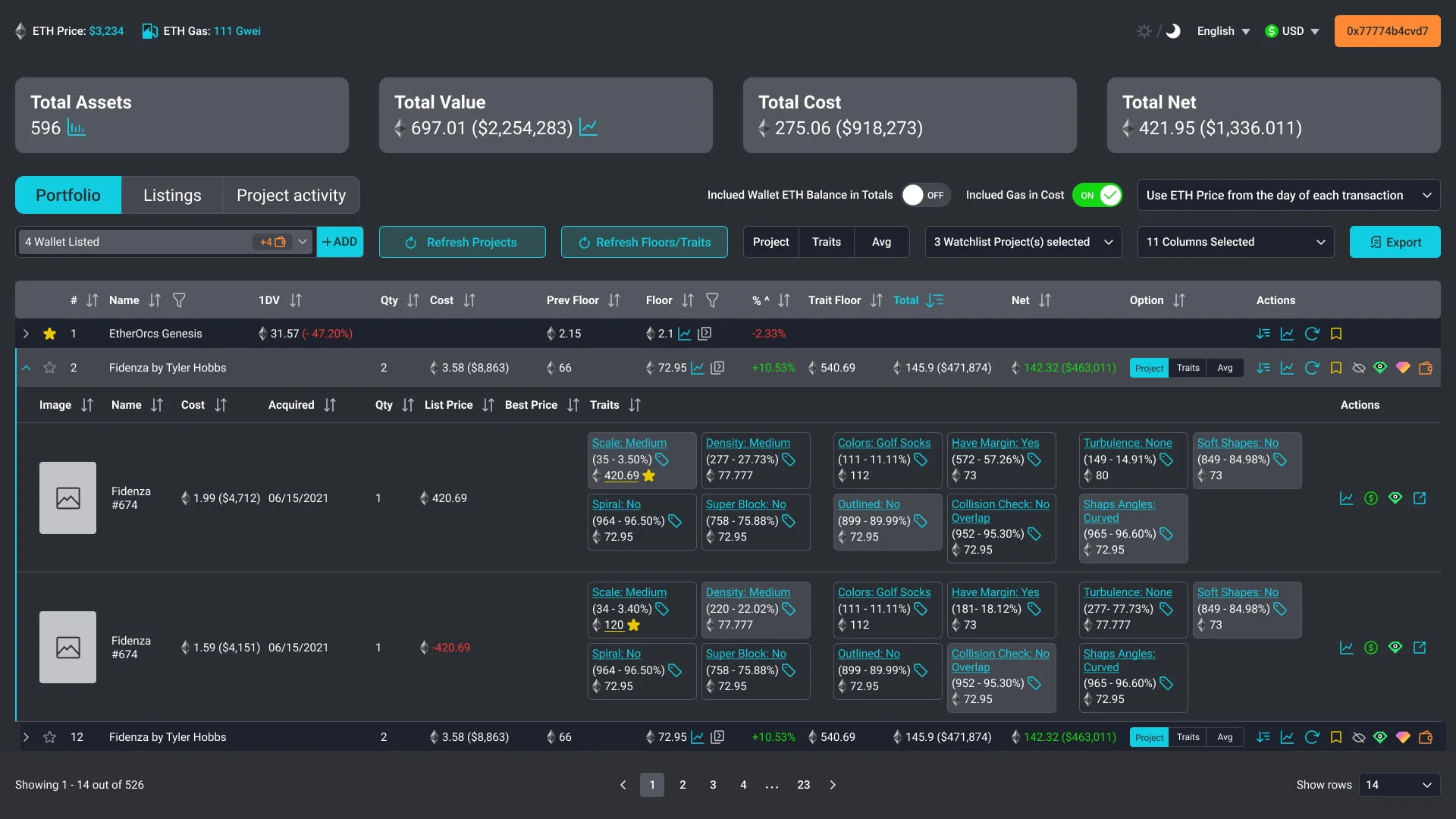
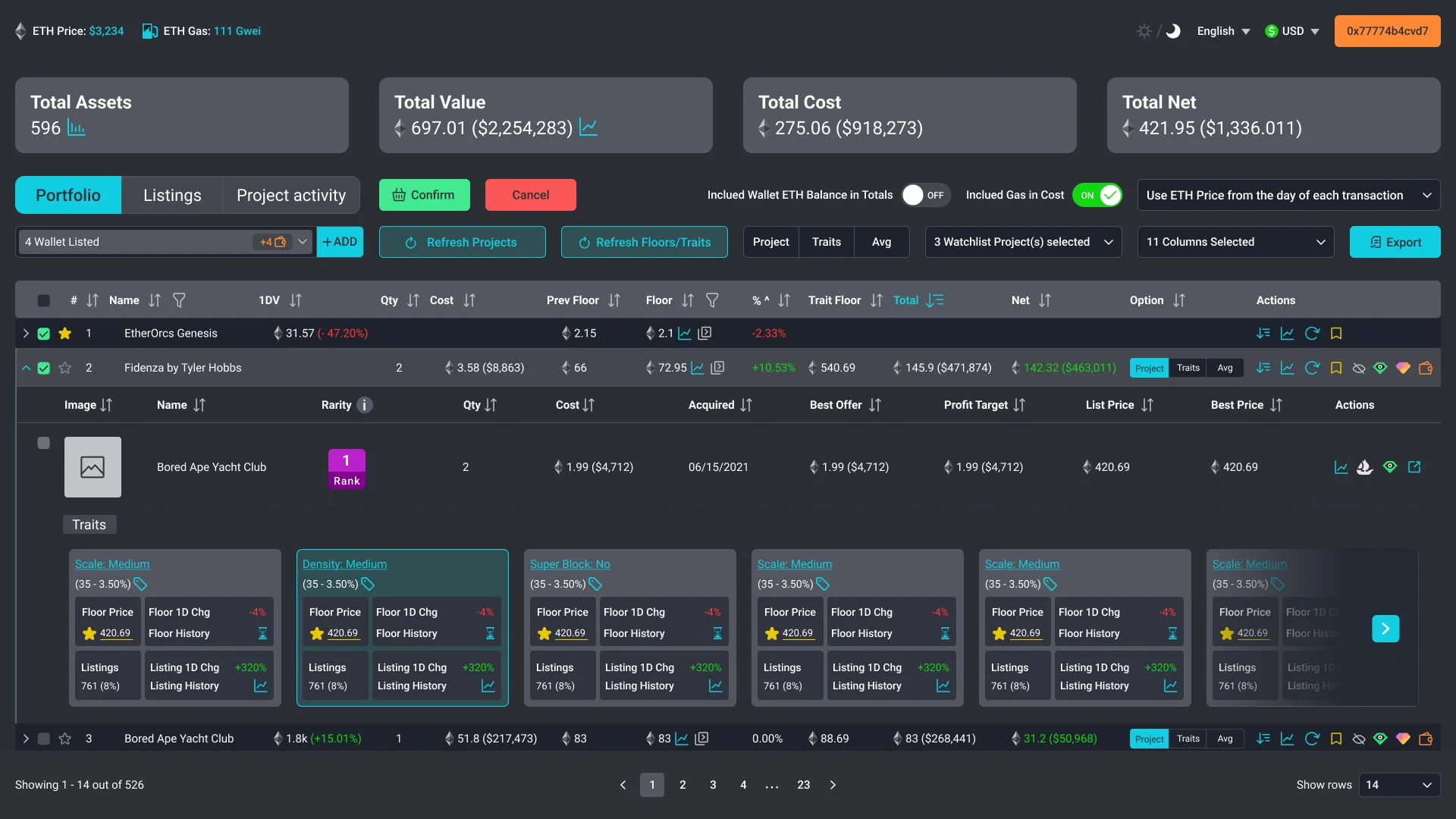
c. Sliding Feature for Expanded NFT Information: To provide users with complete NFT information, we implemented a sliding feature. When a user clicks on a specific NFT row, additional details and traits slide down, revealing a more comprehensive view of the NFT. This allowed users to access all relevant information without overwhelming the initial dashboard view.
Implementation and Feedback:
After implementing the redesigned UI, we conducted usability tests and gathered feedback from a group of users. The feedback was overwhelmingly positive, with users expressing appreciation for the improved contrast and font size. They also found the sliding feature to be intuitive and user-friendly, enabling them to access complete NFT information without leaving the main dashboard view.
Conclusion
By addressing the issues of low contrast, small font size, and limited access to complete NFT information, we successfully improved the cleanliness, usability, and user experience of the crypto dashboard. The enhanced contrast and font size significantly improved readability, while the sliding feature provided users with easy access to complete NFT details. This case study highlights the importance of considering user feedback and continually refining UI/UX design to ensure optimal user experiences in the dynamic field of cryptocurrency management.